
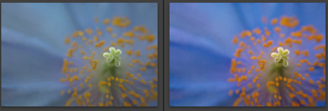
Here you can see the SOOC on the left and my final edit on the right, the SOOC is cool and flat and dull.
click for larger
So how did I get to the final edit?
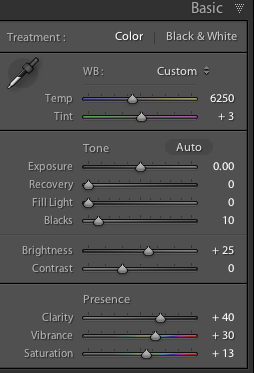
I used my white balance target to do a custom white balance, added in a bit of brightness to the midtones, and a decent amount of black. I then added some clarity (ie midtone contrast), vibrance and a little saturation (I usually don't touch this slider but once in a while it can be very handy).

Added contrast using the tone curve

Used the split toning to add more color, a bit of warmth to the highlights and some blue to the shadows. (I have a couple of presets like this that I have made for myself)
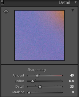
Added some sharpening, I also should probably add some noise reduction to, but for sharing on the web it wasn't really noticeable.
That is it, nothing too major but it brought the colors back in line with what they had looked like in real life.
1 comment:
GREAT post!
Post a Comment