
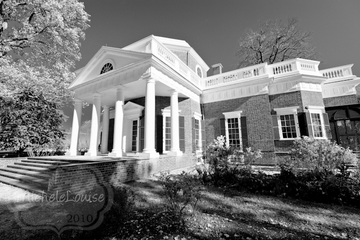
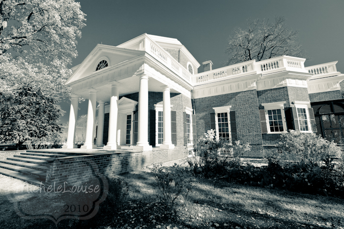
I did go for a bit of an infrared conversion.
Playing around with the split toning I came up with an interesting finding. I read a discussion the other day on sepia versus chocolate black and white images. Here is my idea of what is a chocolate black and white.
I applied the split toning Highlights hue 0 saturation 0 Shadows hue 37 Sat 22. Notice that I applied nothing to the high lights, I just warmed up the shadows or the black part of the black and white.
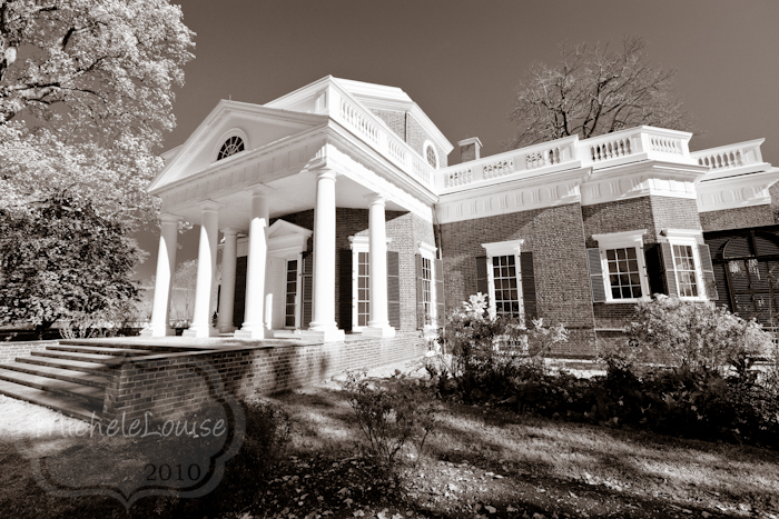
As for the sepia, I did two edits that looked "sepia" to me. I applied the same hue and saturation settings as above to just the highlights (and nothing to the shadows)
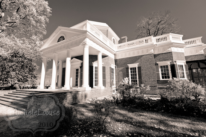
And then to both the highlights and shadows,
This one looks the most like sepia to me. The key to me then to keep your image to chocolate black and white over sepia is to keep the warmth more to the shadows.
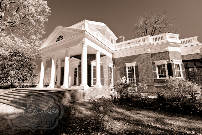
Then just for fun I did this one
Highlights hue 52 Sat 20
Shadows hue 211 saturation 25
I applied a little warmth to the highlights and coolness to the shadows. I like it.
No comments:
Post a Comment