Showing posts with label tips. Show all posts

6.23.2011

Photography Tips 22: Lightroom Graduated Filter

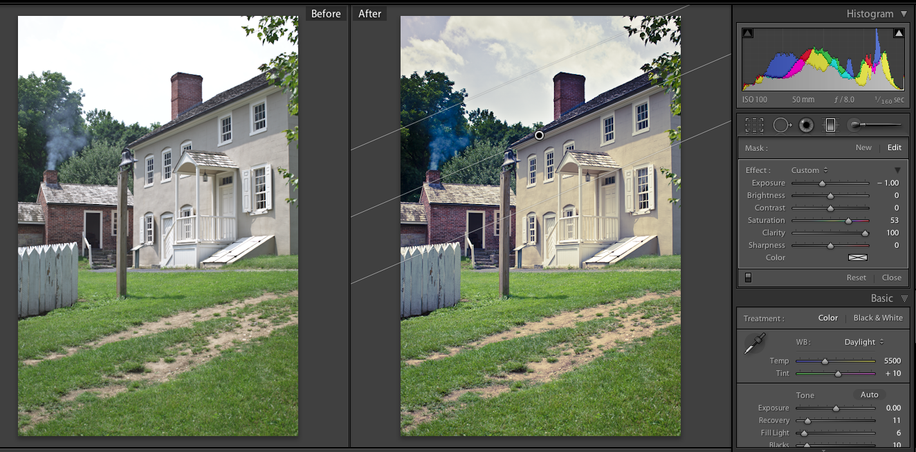
In my blog post yesterday I included a couple of photos I used Lightroom's graduated filter (which I always want to call gradient filter so I might say that by mistake sometimes) option on, and one that I didn't but could have. I am sure this is one of those things that is used more often in landscapes/macros then in portraits but it is worth trying it out sometimes, you might be surprised what it can do for you.

I mainly use this tool on the sky, to balance out a bright sky with a darker foreground so I mostly use the exposure slider. You have all the other sliders available as well that you do for the adjustment brush (well other than the ones that adjust the brush since you don't need those) so you could easily get a LOT more creative than I do most of the time.

1) This first image, I wanted to add back detail to the sky that I had lost during my editing process (probably from increased contrast, and a little bit of brightness), here is my final edit with the filter applied
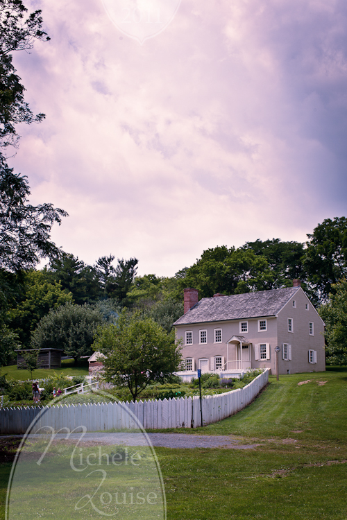

20110618-IMG_8653 by MicheleLouise, on Flickr

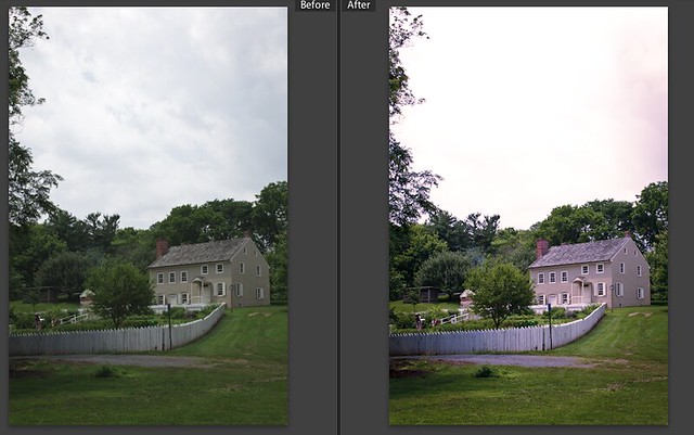
and here is a before/after of just the SOOC, and the edit BEFORE the filter was applied
Link to full size

There was originally more texture in the sky in the SOOC than in my edit, a perfect time to used the exposure slider with the gradient mask to bring down the exposure on the sky and bring back some of that detail instead of having the appearance of a blown out sky.

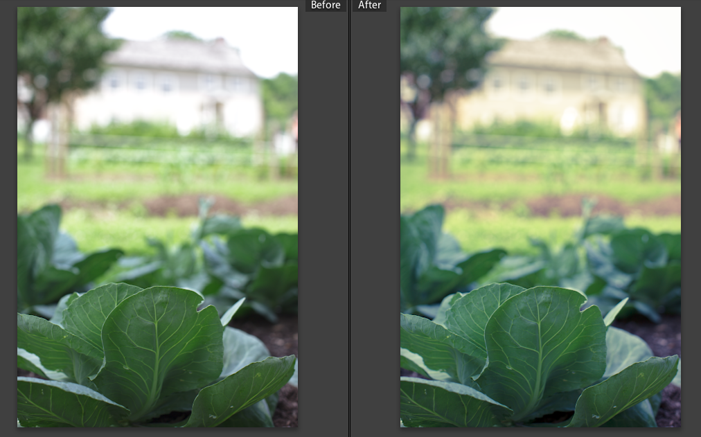
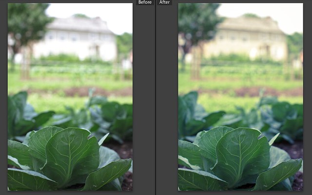
2) This next image is a little different. The cabbage in the front was in the shade and MUCH darker than the house in the background in full sun. On the left is my SOOC and the right is my edit without the filter. To me the house, which I wanted in the background and to be part of the "story" of the image, was too bright and calling too much attention

Link to full size

I added a negative exposure adjustment to the upper part of the image (down to the top of the cabbage) to help balance the two parts of the image, the image below is my final edit with the filter applied.
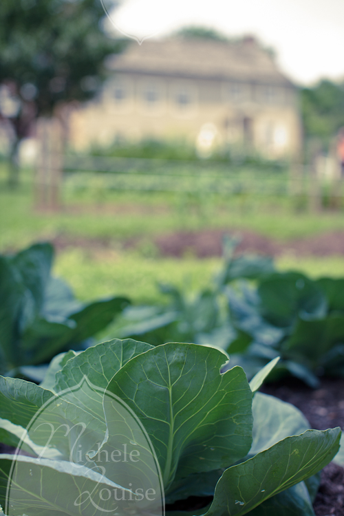

20110618-IMG_8642 by MicheleLouise, on Flickr

3) This photo I didn't use it on, but could have. Here is the edit that was on my blog:
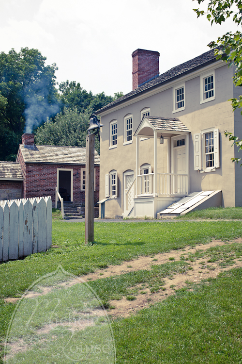

20110618-IMG_8638 by MicheleLouise, on Flickr

and here is the before after with the filter applied.
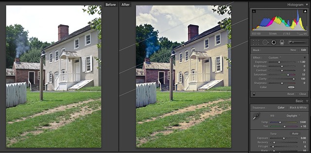

link to full size

You can see that you can even put the filter on an angle if you want to, here that was helpful to allow it to blend in more, the roofline of the house was a good natural breaking point. My goal was to add back some texture to the sky that I lost with my other edits, since I knew that information was there in the original file, so I wasn't stuck with a blown sky.
1) This first image, I wanted to add back detail to the sky that I had lost during my editing process (probably from increased contrast, and a little bit of brightness), here is my final edit with the filter applied


20110618-IMG_8653 by MicheleLouise, on Flickr

and here is a before/after of just the SOOC, and the edit BEFORE the filter was applied

Link to full size

There was originally more texture in the sky in the SOOC than in my edit, a perfect time to used the exposure slider with the gradient mask to bring down the exposure on the sky and bring back some of that detail instead of having the appearance of a blown out sky.

2) This next image is a little different. The cabbage in the front was in the shade and MUCH darker than the house in the background in full sun. On the left is my SOOC and the right is my edit without the filter. To me the house, which I wanted in the background and to be part of the "story" of the image, was too bright and calling too much attention


Link to full size

I added a negative exposure adjustment to the upper part of the image (down to the top of the cabbage) to help balance the two parts of the image, the image below is my final edit with the filter applied.


20110618-IMG_8642 by MicheleLouise, on Flickr

3) This photo I didn't use it on, but could have. Here is the edit that was on my blog:


20110618-IMG_8638 by MicheleLouise, on Flickr

and here is the before after with the filter applied.


link to full size

You can see that you can even put the filter on an angle if you want to, here that was helpful to allow it to blend in more, the roofline of the house was a good natural breaking point. My goal was to add back some texture to the sky that I lost with my other edits, since I knew that information was there in the original file, so I wasn't stuck with a blown sky.

3.09.2011

Photography Tips 22: Flash Diffusion Experiment 1

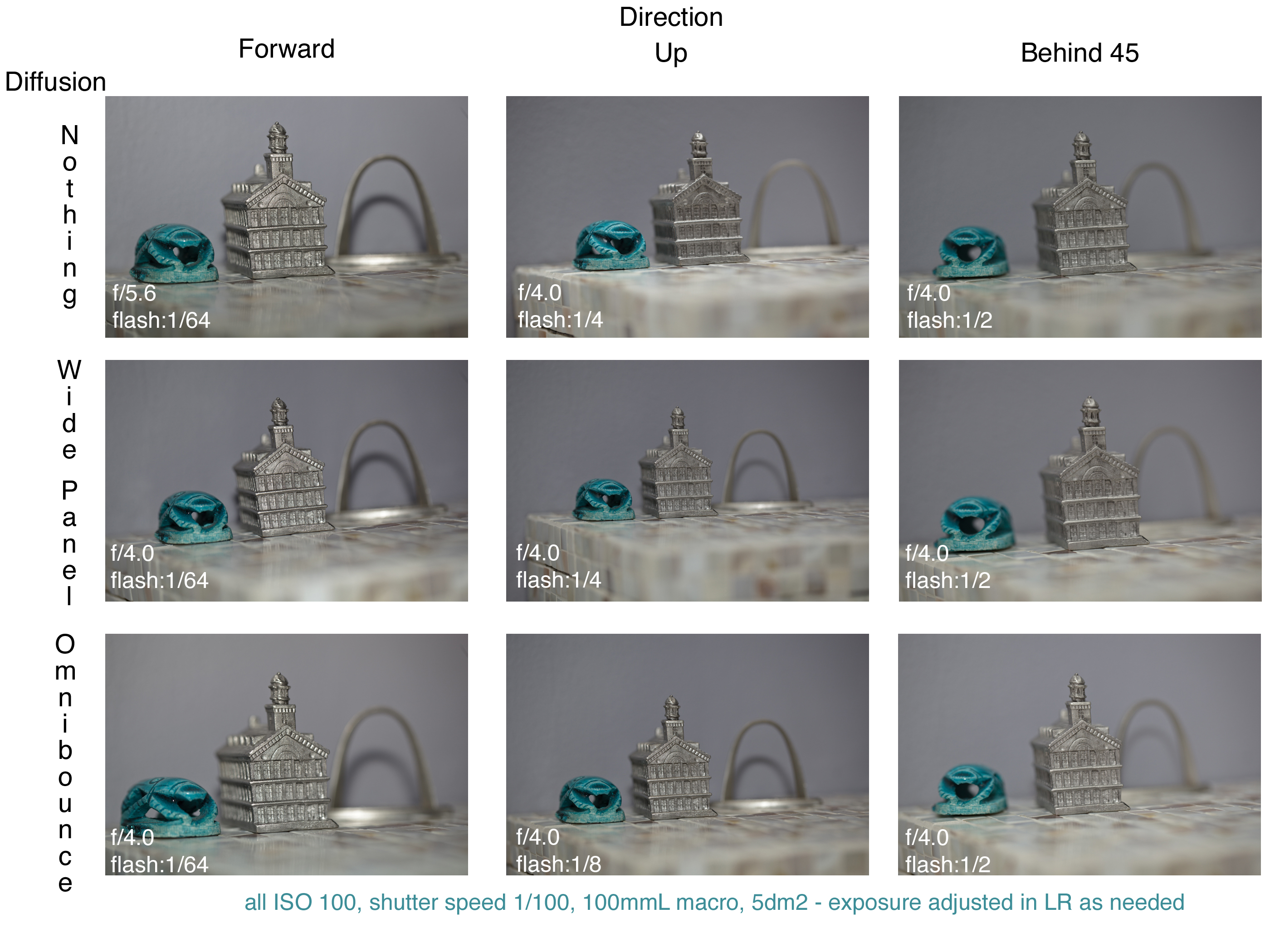
I haven't done any more experiments with this yet but I know more are coming. Anyway, on to the experiment. On one of my message boards a question was asked about the Sto-Fen Omni Bounce flash diffuser and if anyone used it. It made me realize that while I knew I had one, and I use it a lot, I have never really tested to see if it was adding to my images or not. I executed an experiment to test if it diffused the flash, which I assumed that it did, and if that additional diffusion was beneficial. Here are my results.


Click image for full size.

I tried to adjust the flash output to keep the exposure consistent but I wasn't careful enough to get it right on all of them so I did adjust the exposure in post to make them all look similar. So the flash power/settings don't exactly match up to what was ideally needed.

It clearly helps diffuse the flash, and you needed to set the flash to a higher power to get the same exposure if you don't adjust the angle. Depending on what you are aiming for with the flash, I am not sure I am always going to keep the diffuser on. Like when I bounce it behind me, I think it might diffuse too much light forward for some applications. In general this experiment reminded me to really think critically about why I use the gear I do and make sure it is adding positively to the images I make using it.

1.24.2011

What a Difference a Few Years Makes

I always tell people that it is important to keep all your old RAW files (not just your edited images) in case you want to go back and re-edit. After my awesome SIL pinned one of my photos of her wedding from 2007 on pinterest I realized that it is time to take my own advice and go back and re-edit her photos.

My 2007 edit
20071020-IMG_4396

and a quick edit now
20071020-IMG_4396-2

It's amazing how much differently I look at an image now, and how I approach editing it. I also know a lot more about how to edit now. Now to go back and edit the rest! Anyone else want to go back to an old photo and try a re-edit? If you do post a link in the comments.

1.21.2011

Photography Tips 21: Magnification Changes with Extension Tubes on Different Lens

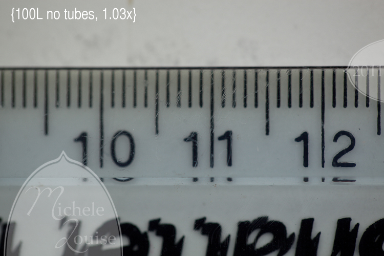
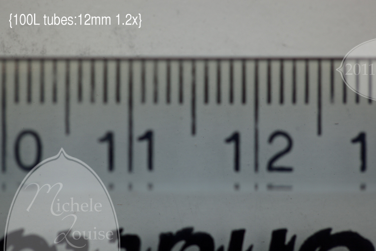
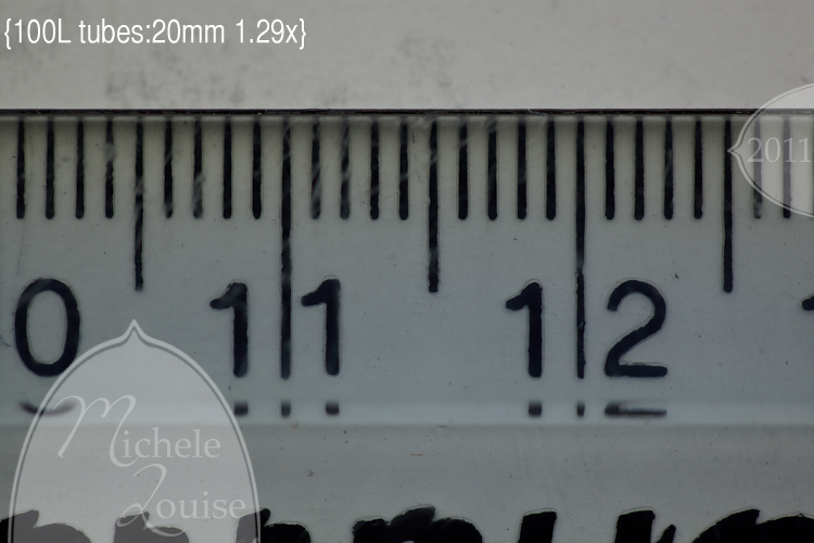
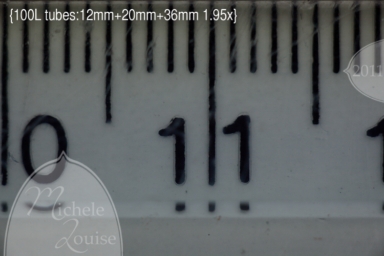
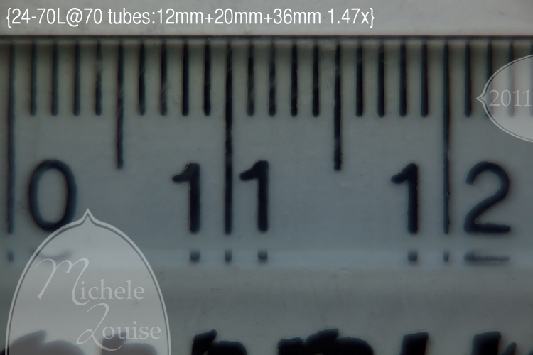
Back in my first macro FAQ post (Photography Tips 12: Macro FAQ 1) I showed you what makes a macro lens a macro lens, and a way to calculate the magnification using a ruler.  I wanted to do a follow up experiment showing how using tubes increases the magnification, not only with my macro lens, but with any lens. 

I started out with the 100L, varying the length of tubes that I attached. 
20110119-IMG_7352

20110119-IMG_7355

20110119-IMG_7358

20110119-IMG_7360

20110119-IMG_7362

The more tubes I added the greater the magnification I got, with all of them on, I could get to nearly twice life size!

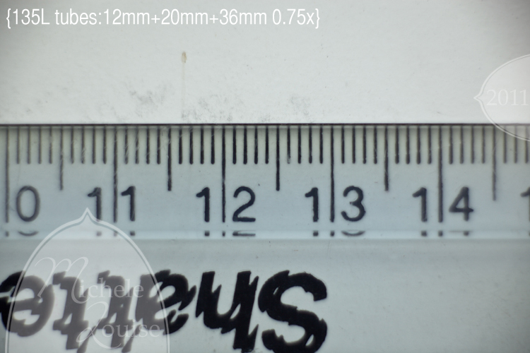
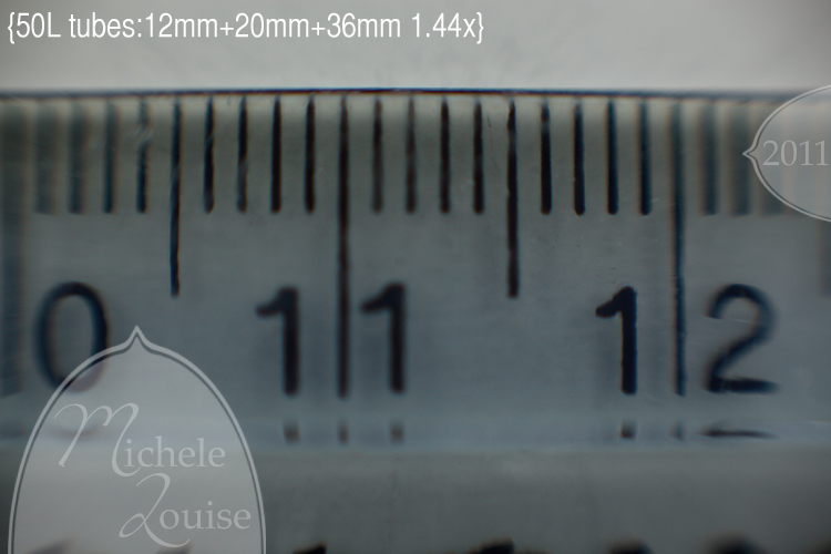
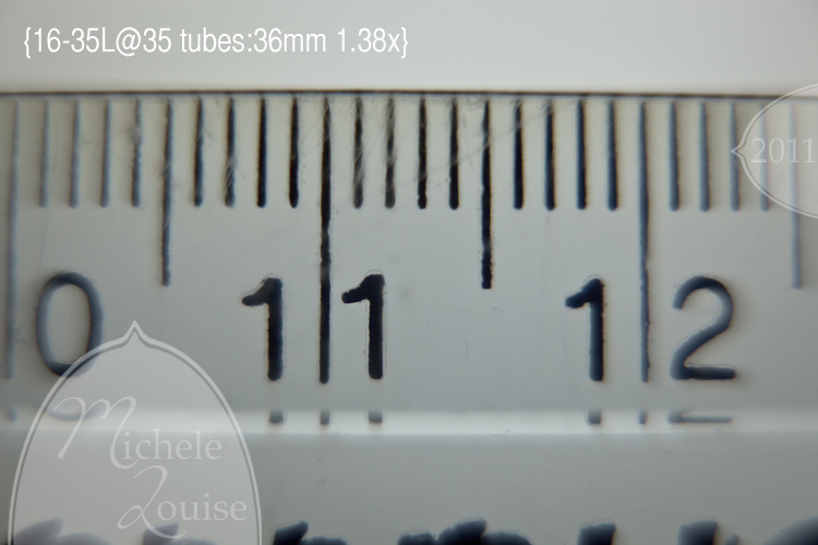
I have so many lenses that I thought for the rest I would just try to get the maximum magnification I can and compare that to the specifications for the lens's maximum magnification without tubes. 

20110119-IMG_7364

20110119-IMG_7365
I think it is interesting with the 50 that you can start to see some barrel distortion.

20110119-IMG_7369
Compare this with the magnification I measure in the previous post to see that without tubes I only got 1/3 life size with this lens, with the tubes I got to almost 1 1/2 times life size, that is a big improvement.

20110119-IMG_7378
Again note the distortion and the lack of sharpness as we move away from the center of the lens, also notice that I had to cut down the number of tubes I was using.  If I put on more than this the focus fell inside the lens where I couldn't measure it. 

20110119-IMG_7380
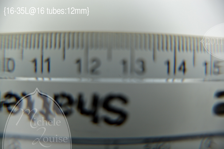
I also tested the 16-35 at 16mm, but even with the smallest tube I would have needed to put the ruler inside the lens to get it in focus, obviously that wasn't an option.  You can still so how much more distortion you are getting at 16mm as well. 

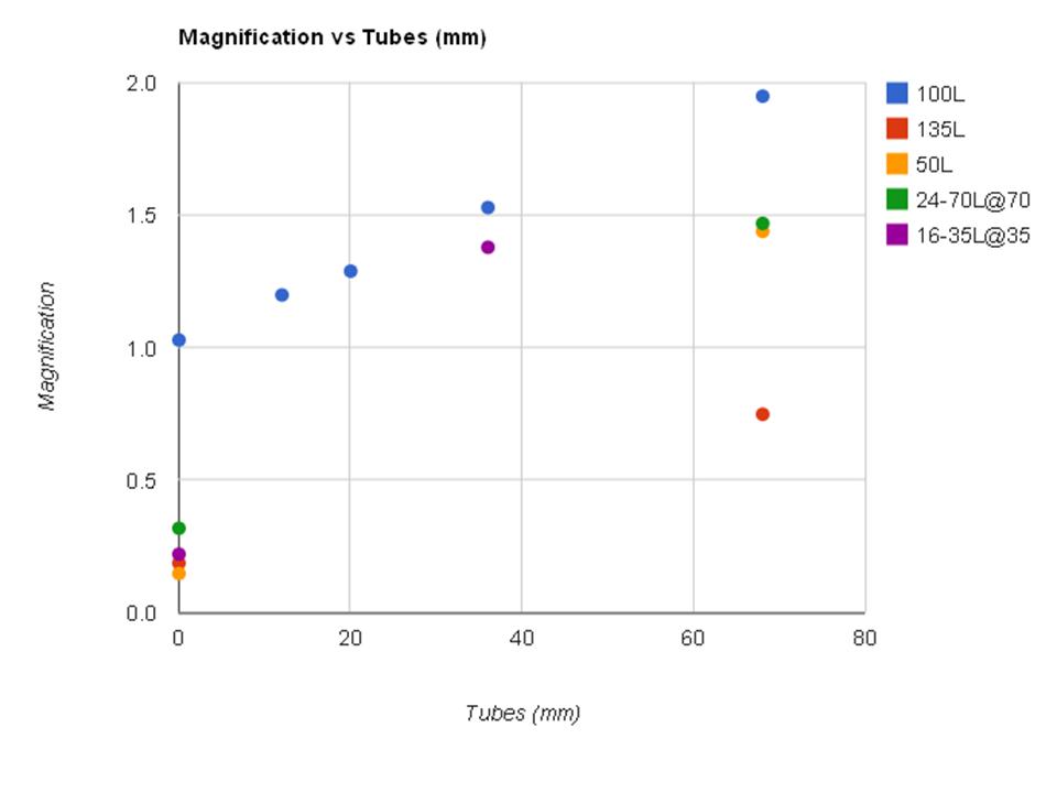
After all of this I had to graph my results to see if there was a trend.
tubes_magnif_chart.jpg
Turns out the magnification goes up in a very linear trend as you add more length of tubes in the data for the 100L.   I assume it would also follow a linear pattern for the other lenses just with a different intercept and probably a different slope.  On the graph I included a starting point for each lens based on the published specifications.  You can see the slope is steeper at shorter focal lengths and much flatter at longer focal lengths. 

What does all of this mean? 

  • Combining tubes with a true macro lens will let you get to magnifications larger than life size.

  • Using tubes on a lens doesn't seem to change the inherent distortion in a lens, in fact it might magnify it since you are so much closer to your subject, I didn't test it but I assume this will be true with compression as well

  • Not all lenses will function well with tubes, especially shorter focal lengths, the tubes may shorten the minimum focusing distance so much you might not be able to focus at all

  • Tubes change the magnification in a linear fashion so if I measure a couple of points I can calculate how many mm of tubes I need to achieve a specific magnification.

  • I can take just my tubes with my 24-70 or my 50 on my next vacation and not worry about missing having a macro lens with me

  • The length of tubes increase the magnification faster on a shorter focal length.  And conversely on a longer focal length you will need more tubes to achieve a higher magnification

12.02.2010

Photography Tips 20: Lightroom Split Toning on Black and Whites

I generally like to keep my black and white images just straight up black and white with no color toning.

IMG_6849
I did go for a bit of an infrared conversion.

Playing around with the split toning I came up with an interesting finding. I read a discussion the other day on sepia versus chocolate black and white images. Here is my idea of what is a chocolate black and white.

IMG_6849-4

I applied the split toning Highlights hue 0 saturation 0 Shadows hue 37 Sat 22. Notice that I applied nothing to the high lights, I just warmed up the shadows or the black part of the black and white.

As for the sepia, I did two edits that looked "sepia" to me. I applied the same hue and saturation settings as above to just the highlights (and nothing to the shadows)
IMG_6849-3

And then to both the highlights and shadows,
IMG_6849-5
This one looks the most like sepia to me. The key to me then to keep your image to chocolate black and white over sepia is to keep the warmth more to the shadows.

Then just for fun I did this one
IMG_6849-2
Highlights hue 52 Sat 20
Shadows hue 211 saturation 25
I applied a little warmth to the highlights and coolness to the shadows. I like it.

11.21.2010

Photography Tips 19: Lightroom Highlight Alert - How much protection does it give you?

A post the other day on one of my photo boards got me thinking on finding out what is Lightroom's definition of what is blown and how does that compare to the threshold at which printers run into issues.

Various print companies (WHCC, Miller's etc) have admitted to having issues printing whites that fall between 230-255, so you need to give yourself some room away from 255 if you want to retain detail in an area when printed. What specific value you limit to will be a judgment call you will have to make based on where you print (and where your clients if you have them may print). There is a chance that something will look fine on your screen but like crap when printed, and you want to produce images that look great in both situations right?

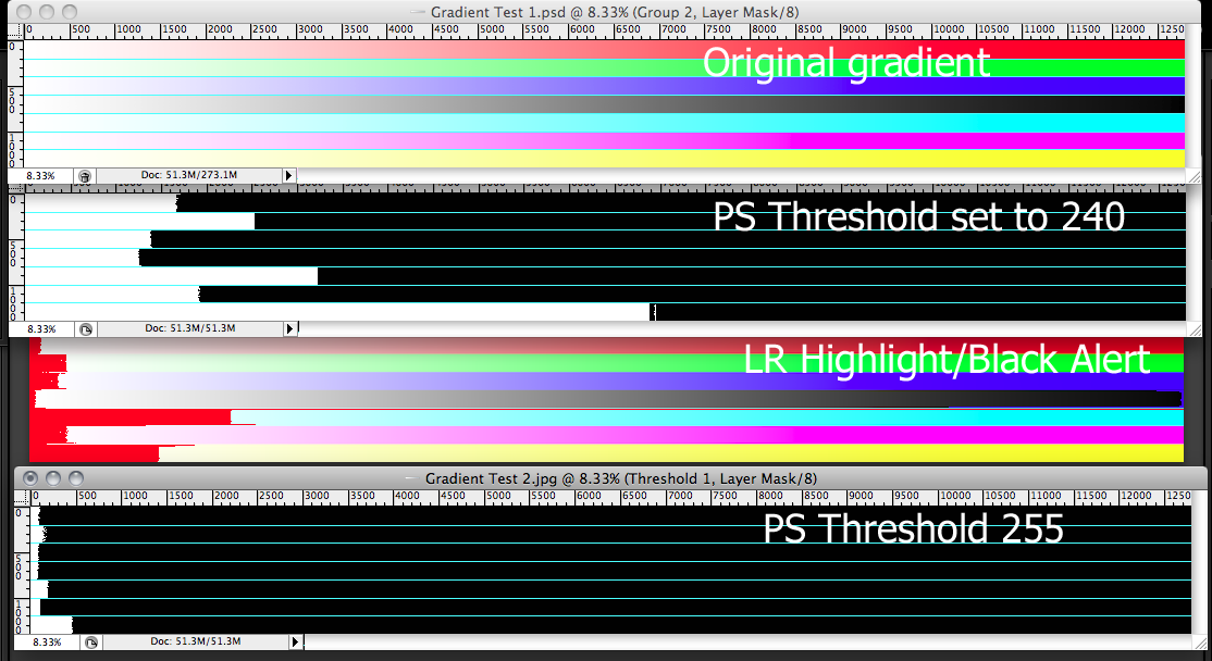
I made a little test document in PS to compare where the threshold mask would tell you that you were at risk of losing detail to compare to the highlight alert in LR. Here are my results


**Click for larger**


Looking at this you can see that Lightroom has the limit where it alerts you in red for blown highlights (hit the J key to toggle this on and off) VERY high compared to a threshold mask in PS set to 240. To me this says that we can't just back off a little bit from having the red alert in Lightroom, we need to be well away from that.

Lightroom also isn't going to tell you if you blow just one channel that should be there 1) it doesn't know it should be there and 2) it seems to only look for pure white. Lightroom's highlight alert is going to be no help in telling you if you blew the red channel in your skin for example. I hope this information is useful!

11.11.2010

Photography Tips 18: Basic Lightroom Edits

Most of my editing in the Develop module in Lightroom is pretty basic and clean. It starts with my import preset that is applied on import of RAW images into LR. I went over that a bit in this post Import Preset. The basic settings for mine are +3 blacks, +25 brightness, +40 clarity, +14 highlights, -9 shadows, medium contrast point curve, and the camera profile set to camera neutral.

I start where I left off with the import/organizing workflow, with a group of picked images in a folder, though a different group.

(click for larger image)

Then we move over to the develop module where we can see the import preset settings already applied.

(click for larger image)

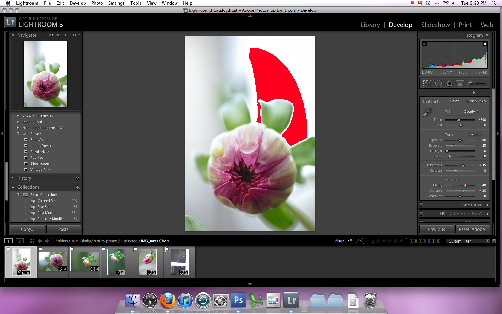
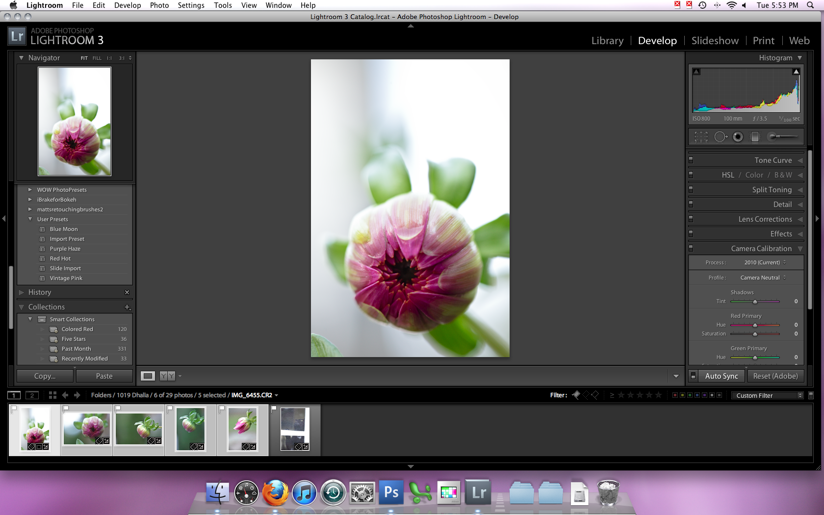
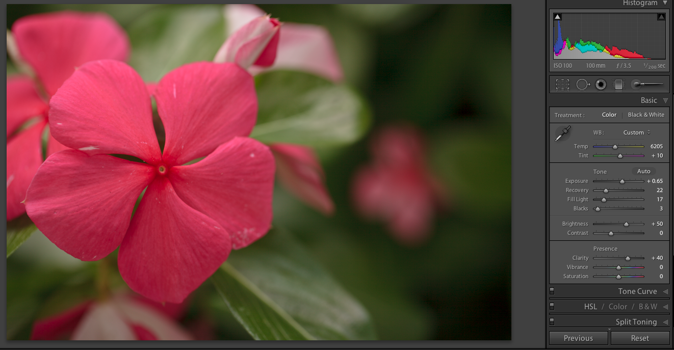
Looking at this image I can see that it is a little cool, needs a white balance adjustment and it also is a little blown out in spots. I changed the white balance to cloudy (Temp from 6350 to 6500 and tint from +14 to +10). To deal with the blown areas I pulled up the recovery slider to +20, I pull it up to where I stop to see any recovery in the important areas (here on the flower) and then I pull it back just a bit. You can see in the image blow all that is blown now is the background. I pulled up the blacks to +10 and increased the brightness from +25 to +35 so it didn't look so flat. Since this is a flower and I wanted it to be a little colorful I also pulled the vibrance up to +20 (note that I never use the saturation slider, it is too heavy handed for how I like to edit, but I am sure it works for some people.


After that I thought it still looked a bit flat so I played around with the tone curve a little bit. Mainly I pulled down the left part of the curve just a bit to darken the shadows even more.


Next since I shot this at ISO 800 I needed to do a little bit of noise reduction just to clean up the images. I set the lumiance to +10 and the color to +10 as well. I start with the color slider and move it until nearly all of it is gone, and then I back off a little bit, I don't want it over-smooth, then I repeat with the luminance slider. Since 10 is a pretty low number for both of these I didn't use the other sliders to add back in detail at all.


Once I am happy with this image, since these are all pretty much the same I sync my edits.


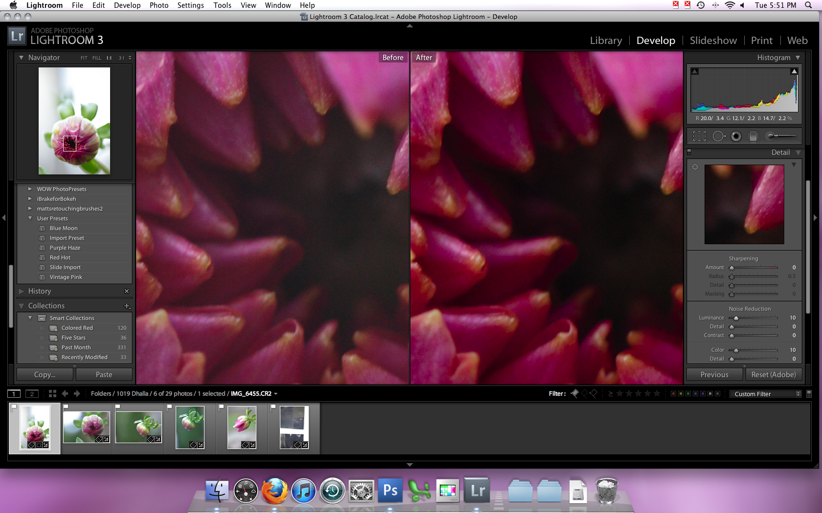
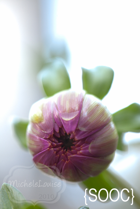
To see how little editing it really is, let's compare a true SOOC image (with even my import preset settings removed other than the camera profile).
IMG_6455-2

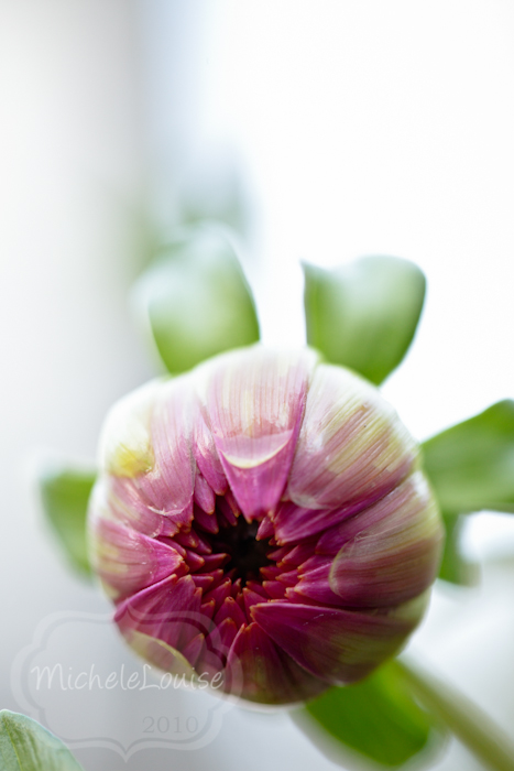
to my final edit
IMG_6455

You can see that really it doesn't look a lot different, just a little more polished. Some images require a bit more work that this, and some I edit more just for fun. I will cover that in a future post.

11.03.2010

Photography Tips 17: My Lightroom Import/Organization Workflow

I wrote up this post for a message board I am on, a lot of questions were being asked about how to use Lightroom so a couple of us wrote up our workflows. This first post is about how I import my images into Lightroom and how I use it to organize my files. Just because something works for me doesn't mean you have to do it that way or the way you have done it before is wrong. It is just how I do things, take what you will from it.

I working in Lightroom 3, some things will be different if you have an older version of Lightroom.

I choose to download my images myself to my harddrive in a specific folder structure.

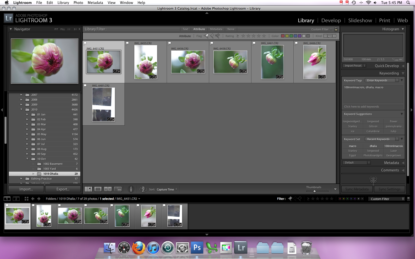
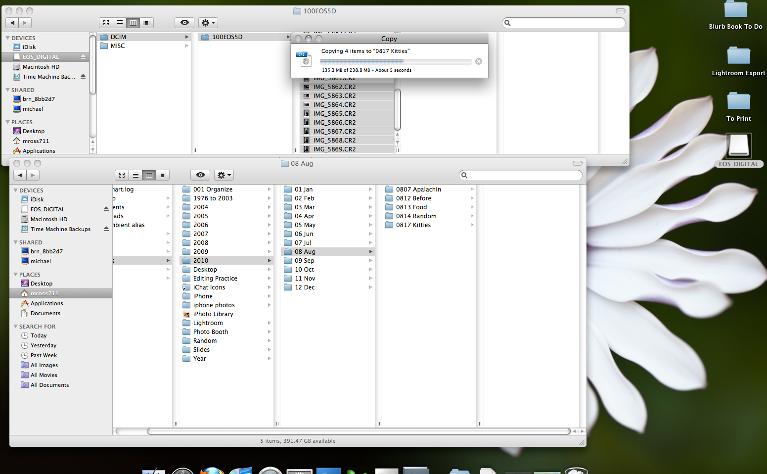
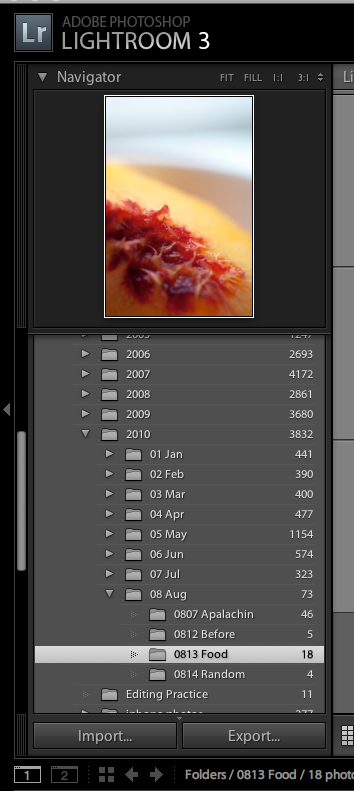
you can see that step here and my folder structure. 2010>08 August>0817 Kitties and I place my RAW files in that folder. If I have multiple things from the same day that I want to have in different folders I do this now (like on our vacations I make a folder (starting with the date) for each main sight we see that day (pyramids, sphinx, step pyramid)). The reason that I organize like this is that I am pretty good at remembering approximately when something happened, and a single photo can't be taken on more than one day though it can include more than one subject. To deal with that I use the keywords which will help me find an image later if I know what was in it and keyworded it correctly.
Next I import the images into LR.
I click on the import button you see at the bottom of the left panel in the library module

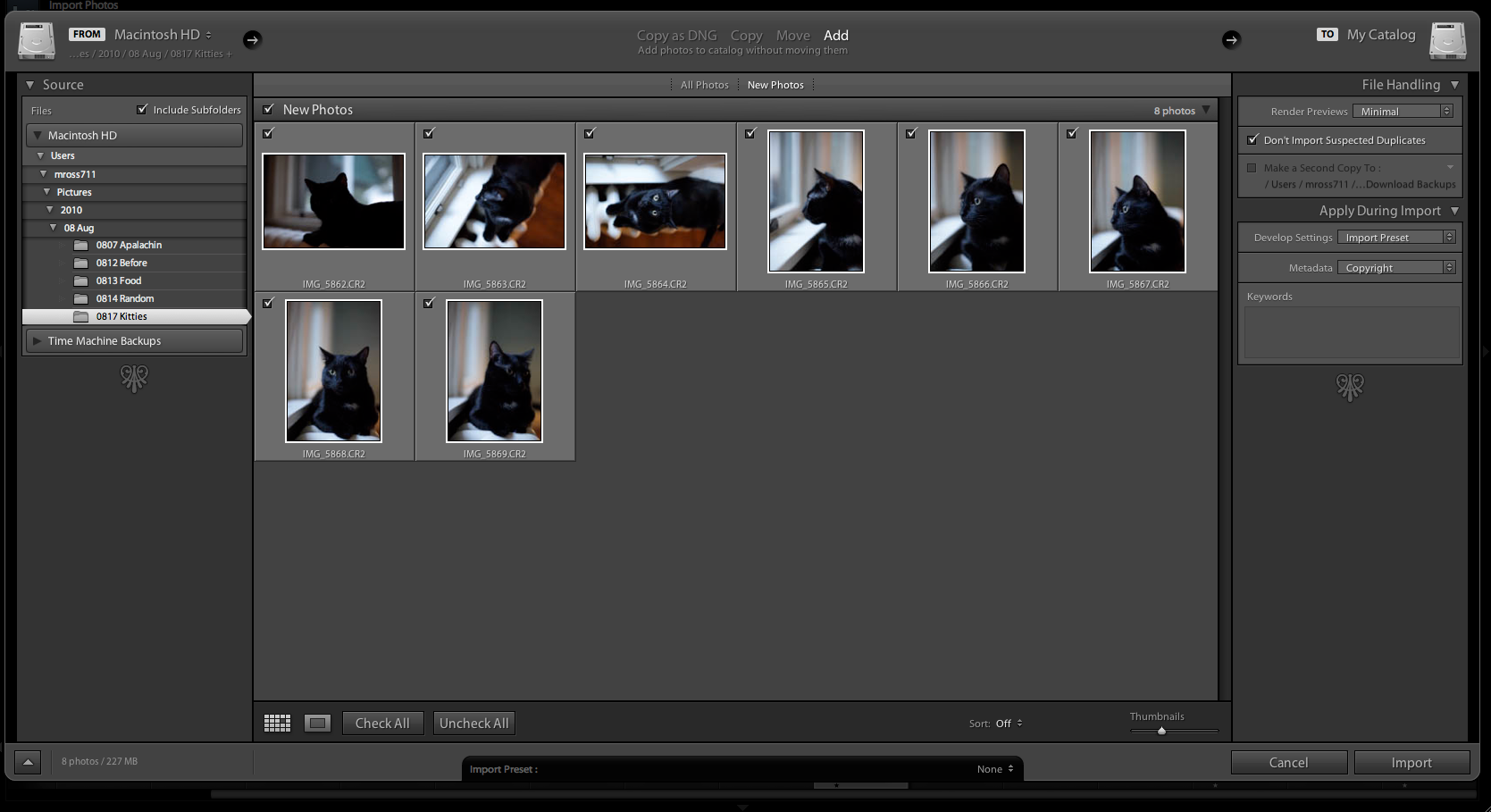
This brings up the import dialog box.

In the source area I browse to the new folder of images I just made (or folders if there is more than one), then I confirm the images are correct in the preview and that I am Adding them to the catalog without moving them (at the top). I have the preview rendering set to minimal (on the right) and I apply my import develop preset and my copyright preset on import. I discussed my import preset in this post. When I do posts on my workflow in the develop module I will go over why I use those settings and how they have changed since that post. I normally also add keywords that apply to all the images during import. Then I import.

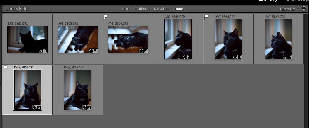
Then in the library module the images come up in grid (g) view, I switch to the expanded view (e) and scroll through the images marking my picks (p) and rejects to be deleted (x). Then I come back to grid view (g)

From here I will go up to the menu and remove the rejects from my hard drive and then filter to the picks to move to the develop module for editing (which will be covered in the next work flow post.

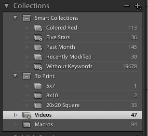
One of my new loves in the library module is collections. I have a collection set up that automatically pulls in any video files I import so that I can find them all quickly

I also have collections set up of images I want to print, and what size. I have one for macros, though this is generally my best macros. I have a few other collections I want to start, images for etsy shop, one for each nephew and my niece, one of blogged images, a portfolio one etc. This would be great for anyone in business to have one for each gallery area on their website and then they can use it to update that with new images.

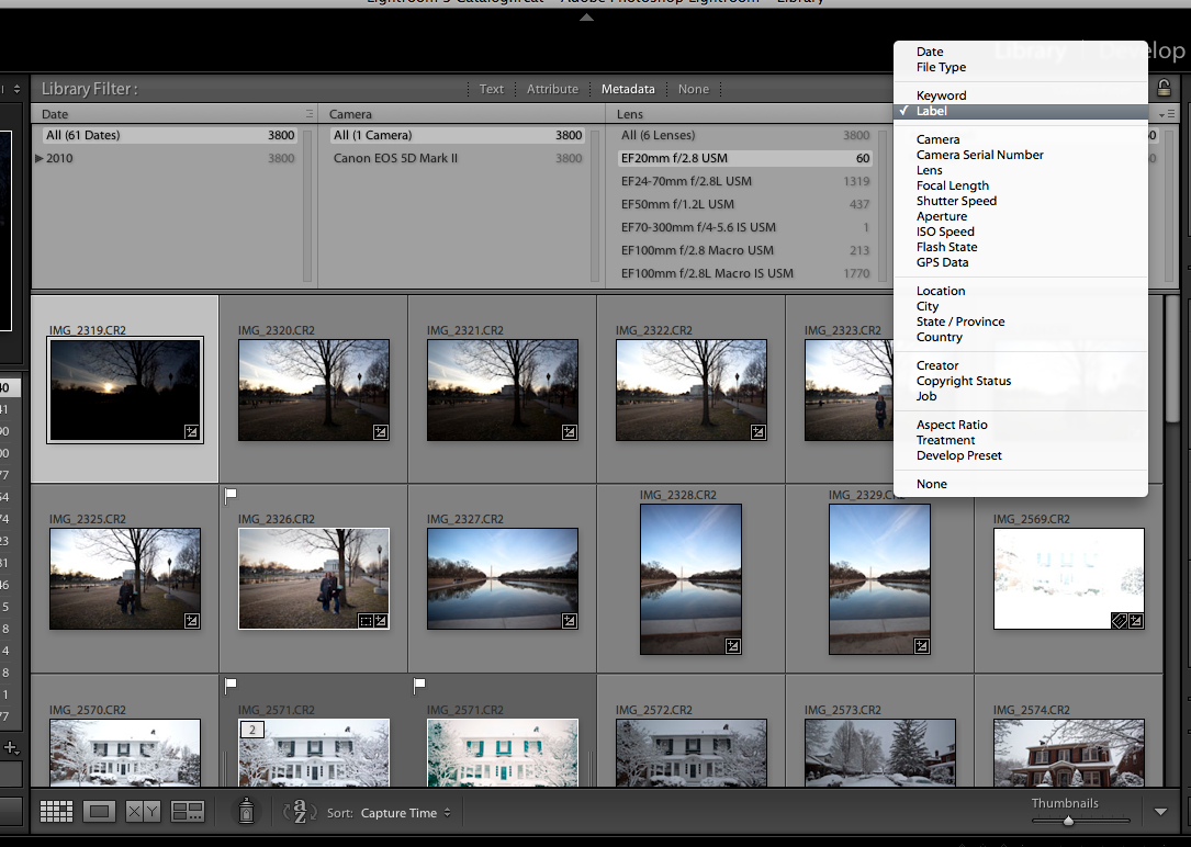
Another of my favorite parts of the library module is the search bar at the top.

You can see on the right all the options you have to search by, which are super handy. I have used this before to see how much I use a certain lens, and how that changed when I went full frame for example.

Next time we will move on to the Develop module.

9.02.2010

Photography Tips 16: Posterization

This wasn't a topic I was planning to cover but the question came up on a message board I am on so I thought I would share my thoughts here as well. First what is posterization?


Posterization of an image entails conversion of a continuous gradation of tone to several regions of fewer tones, with abrupt changes from one tone to another. This was originally done with photographic processes to create posters. It can now be done photographically or with digital image processing, and may be deliberate or may be an unintended artifact of color quantization.

source

The tricky part is, this isn't something your histogram can show you, you aren't blowing any channels to make this happen. You have to learn to look for it and then change your editing as needed to undo/prevent it.

Here is an image I took on Saturday of a bright pink flower, which is a common color to have this issue with. You can see my my LR edits (this was a little underexposed SOOC but I was just messing around when we were in Georgetown), this is my final edited version

click for larger

Here is a screen capture of the detail in the petal of that flower

You can see the gradual change in color here.

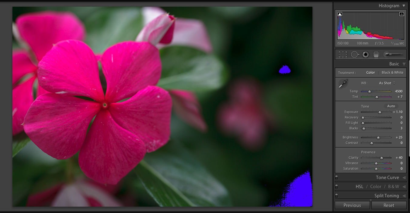
Here is an edit where I just did my import preset (and no white balance edit) and tried to pull the exposure up. I have the red for blown highlights turned on and you can see nothing is blown (some darks are clipped).

You can see something funky is going on with that petal we had just zoomed in on above.

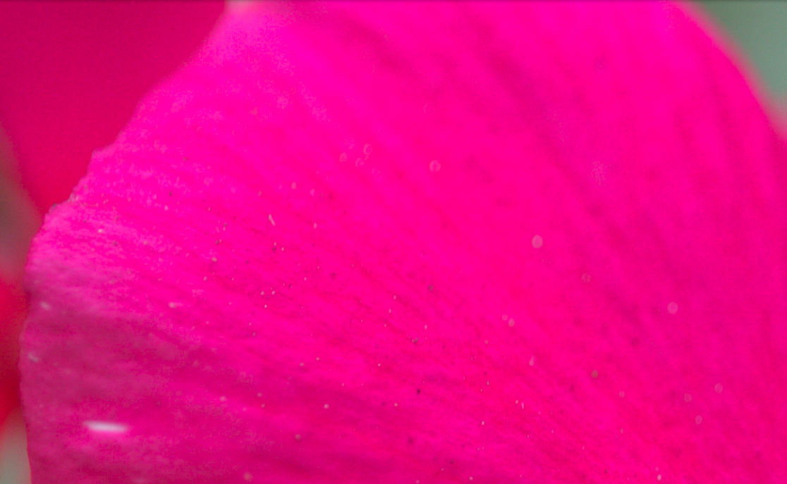
Lets zoom in again.

Now you can see the posterization.

I don't really know enough about how to not make it happen in editing, other than to recognize it, watch for it and undo whatever you just did that created it.

LinkWithin

Related Posts Plugin for WordPress, Blogger...